
As part of the launch of the 24i's new product, I was in charge of the visual identity, look and feel of the visual materials around this product.
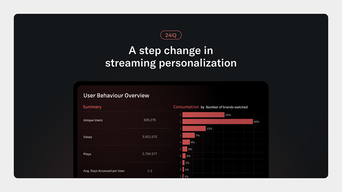
In a nutshell, the company launched unique managed service that can be used with any video streaming platform. It harnesses the power of your data to take recommendations and personalization. The product combines AI-powered algorithms and human analysis to drive dynamic.
☝️Please, keep in mind that I only worked on the visuals for marketing purposes. All copy, product designs and development work have been done by other stakeholders of the project.
__________________________________________________
1. General look and feel of the marketing visuals
All the communication assets have been built on a linear gradient dark background combined with a orange-peach radial gradient behind the product image.
The dark theme has been chosen to make the new product stand out from the other products with a lighter visual identity. Therefore, the dark background perfectly fits the data and analytics theme. The peach colour is one of the primary colours of the brand.

Banners and social posts
Gradients spec

__________________________________________________
2. Social media visual materials
Social media grid
All communication visuals for social media have been built following this grid.


Example of a social media post
__________________________________________________
3. Emails
All emails visuals have been built following the visual identity of the product.
The emails have been tested on desktop and mobiles and on a light and dark background.
The email has been created in collaboration with a business analyst.

__________________________________________________
4. Website
All website artboards have been done on Sketch. To make the work easier and quicker, a design system has been created and used.
The development work has been done on Webflow in collaboration with an in-house developer.
All website content and spec have been delivered in advanced to the developer in a development kit. This development kit was made up of a sketch file, extra indication regarding the spacing system and a folder with well-organised and names pictures and svg files.


Example of extra guidelines for the developer and other designers

Spacing indications for the developper
__________________________________________________
5. Print materials
Some tree-folds have been developed for trade shows.


Anatomy of the new component for the threefold
__________________________________________________